Meet Our New Brand Identity
As we redefine our brand,
we strive to infuse youthfulness and a relaxed atmosphere into Xmind,
delivering a welcoming and friendly brand image to each user.
we strive to infuse youthfulness and a relaxed atmosphere into Xmind,
delivering a welcoming and friendly brand image to each user.
New Visual Language
In our rejuvenated visual language, we combine youthful vibrancy with elegant simplicity. Discover our redesigned logo, now lowercase, reflecting a more friendly and approachable mind mapping experience.
The image of butterfly,
the storm of thinking
the storm of thinking
Like the ripple caused by a butterfly's wings, we have embraced a captivating butterfly motif in the new Xmind logo. With its graceful depiction of a poised butterfly in flight, our logo symbolizes the power of capturing fleeting moments of inspiration. We aspire to empower users, enabling them to harness these ephemeral sparks of creativity and transform them into lasting ideas.
The Magical X,
explore beyond limits
explore beyond limits
“X” represents change, expansiveness, and boundless possibilities. This constant evolution and innovation embody the core spirit of Xmind. In our new logo, we have retained the consistent “X” element that represents Xmind. We hope to carry forward the spirit of innovation and relentless exploration that “X” symbolizes within the Xmind team.
Evolving from
X+mind to xmind
X+mind to xmind
Once just an amalgamation of "X" and "mind", xmind has now transformed into a verb that signifies "mind mapping and brainstorming", embodying the essence of capturing ideas and mapping thoughts with ease and clarity. Let’s xmind it!
Collision of colors,
igniting more sparks
igniting more sparks
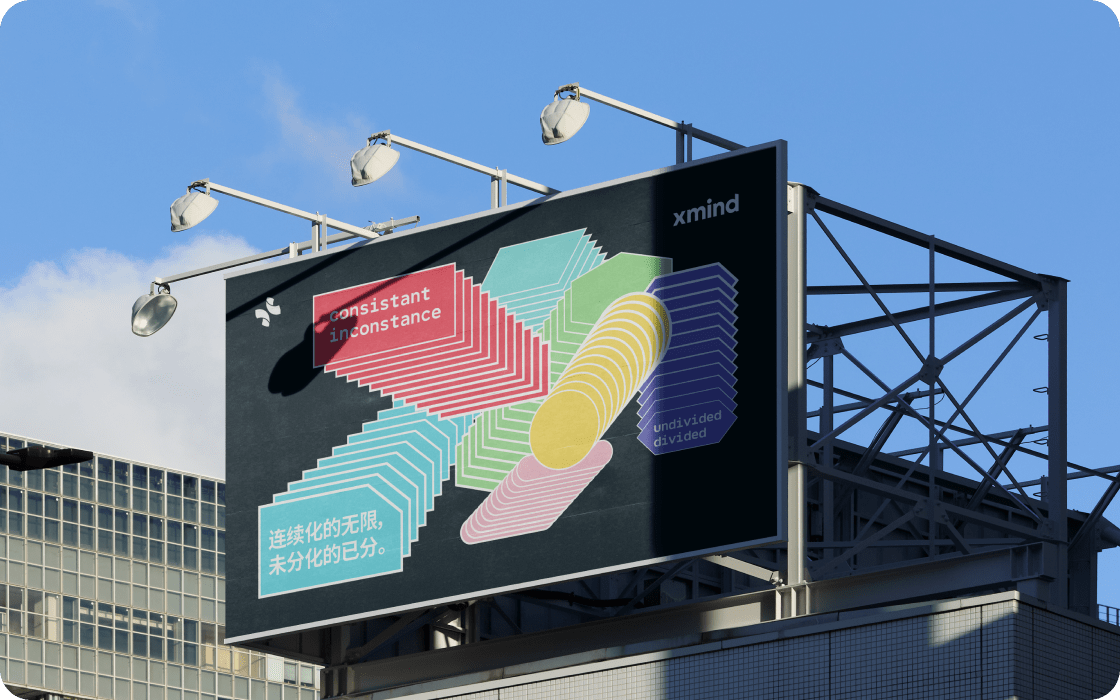
In the new upgraded brand visual elements of Xmind, we have embraced bolder and more impactful visual elements to shape our brand ambiance. Transitioning from a primary red color, we have ventured into a multi-color palette, unexpectedly bringing together colors, typography, and illustrations. Embrace the delightful moments when different ideas collide while organizing your thoughts, with our revamped visual experience.

It’s just the beginning
With 16 years of dedicated focus in the field of mind mapping, Xmind has now turned a new page with this brand upgrade.
We have countless ideas, crazy ones, innovative ones and fun ones, waiting to be brought to life.
We are grateful to have been chosen among numerous tools and look forward to bringing you more surprises in the days to come.
Read Xmind Logo GuidelinesWe have countless ideas, crazy ones, innovative ones and fun ones, waiting to be brought to life.
We are grateful to have been chosen among numerous tools and look forward to bringing you more surprises in the days to come.